Interaction of Color
After a recent work experience that for me, was rather grueling, I found I needed to experiment with colour. I decided to try to recreate, using fabric, some experiments that Joseph Alber taught to his art students.
Joseph Alber’s text —Interaction of Color—is filled with experiments / activities to demonstrate how colour very much depends on the colours of other objects in the surround. The physical makeup within the eye of the viewer determines the intensity and degree of colour of an object. In 1963, Albers promoted learning as an act of experimentation and trial and error. This is my way of going about learning; and one I have promoted with my students during 40 years of teaching. He wasn’t unique in the 60’s promoting this strategy. I had been taught using this technique in my own small town, elementary school context.
I needed to play with the fabric pieces to help me work out in my own mind how things had ‘gone wrong’ in my work environment. As humans we try to adjust to those around us. If the environment is not compatible with our own values, internal conflict ensues, causing mental disharmony. This of course results in poor health. Just as colour is changed by the other colours around it, so humans too are influenced by their environments. I did not like the subtle changes I was making in my own behaviours while trying to adjust to the working environment. Thus, I decided to get out.

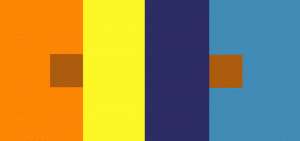
Indigo is considered a ‘true blue’. This image comes from Eweknit.ca
I started playing with two of Alber’s colour theory concepts. I was searching for ‘true blue’.
Indigo is often considered ‘true blue’, as is cerulean blue. Wikipedia tells us that “cerulean was used to describe blue pigments, particularly mixtures of copper and cobaltous oxides.” The image to the right demonstrates a range of shades of blue, and how they differ when located with other items .
THE RELATIVITY OF COLOUR
First,I experimented with his task of demonstrating how colous can appear as two different tones just by arranging the surrounding colours.
A color has many faces, and one color can be made to appear as two different colors. Here it is almost unbelievable that the left small and the right small squares are part of the same paper strip and therefore are the same color. And no normal human eye is able to see both squares — alike.
I used a cerulean blue strip of fabric, placing it between other fabrics to see if I could create the difference in intensity suggested by Albers in his own class activities.
Second, was the task of using the complementary colour to create ‘true blue’. This is using no pigment at all. It is using the physical reaction that is created in the eyes cones & rods by saturating them with one image for 30 seconds, then moving the gaze to a white space. No longer does the eye see the original colour, but presents the complement to the viewer.
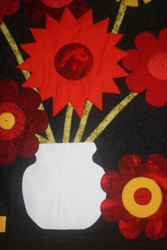
True Blue Vase Wall quilt (Cherry Stewart 2015)
My original work with circles, ultimately turned into a quilt that I have entitled ‘Universal Blue’. Not satisfied with the design (or my craftsmanship) I took on my husband’s suggestion of creating a ‘Blue Vase’ through the illusory use of red/orange flowers.
While I am now satisfied with the design, arrangement, and choice of colours to create the ‘Blue Vase’, I am aware that this lesson means little to anyone else. Unless the viewer also understands the colour theory of seeing a colour after concentrating on its complement, of course they will never see the ‘Blue Vase’.
I wonder, what does this mean to me in the social environment? Is there a lesson here that will help me deal with the ‘real’ world? Does an intensity of concentration on one element in the environment create a reaction that impacts how we see other elements in the social environment?