How does my daily email support my design thinking?
My email inbox this morning was filled with three sorts of emails. The first series was house sit opportunities – these were easily deleted as we have booked ourselves up until end of June. We will think about our next location after I have submitted the final PhD document, which I am planning will be before that!
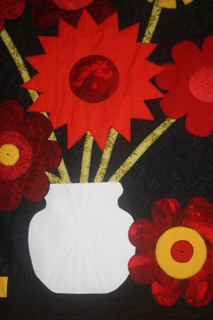
Online support from Quilters
The second group was from quilting sites I have joined. This raised my awareness to the opportunities available for quilters to do online courses to learn their craft. In my past, I learned my sewing and quilting from my mother and from the generations before her. Then I had opportunities while at primary and secondary school, and then did some at university. As mentioned earlier these were my mental health maintenance courses. Since leaving university, books, and weekend workshops have supplemented my own experimentation. This morning, I marveled at how our craft has taken on, and accepted the use of the Internet for passing on the skills and knowledge previously inaccessible to people like myself who live in isolated and remote areas of the world.
Instructional Design
My professional life has been ‘education’. Working in primary schools, vocational education institutions, and universities has been my income stream. In all these situations I have been interested in ‘distance education’. Once introduced to the computers and the ability to connect and communicate with these tools, back in 1986, I have since explored the opportunities to live remotely and still feel part of the urban world.
The final group of emails was from instructional design and academic groups that I belong to. There is a lot in common with patchwork and quilting and instructional design. The information shared this morning by John Laskaris, of TalentBlog regarding what needs to be considered when creating a learning experience for students is similar to the process one needs to engage with when designing a quilt. Most important is the purpose! Laskaris suggests the following considerations when involved in instructional design. Here’s how I might apply them to my textile design planning.
What is my objective?
In instructional design, the purpose might be sharing information, teaching a skill or promoting a change in behavior. Each requires a different approach. So it is with designing a quilt, wall hanging or any other piece of textile art. When designing a textile creation, I need to determine first why I want to make this object.
- Who is going to use this or look at it? Is it for me or someone else?
- When I am finished am I going to want to enter it into a Quilting show?
- Is it to be another of my ‘mental health’ projects?
- Will I add it to the pile of quilts for the Children’s Hospital?
What resources will be needed?
- Am I doing this as an experiment with techniques, tools or materials?
- Do I want to make something practical or a ‘work of art’ for looking at?
- If the finished product a bed cover how big do I want to make it? Do I want it to just cover the top of the bed, or hand down the sides of the bed? Will it need a pillow allowance and have adjustments for the corners and hems?
Do I need to consider the detail, craftsmanship, and evaluation criteria set by others?
- Will the finished item be for showing to others through exhibition, or for my own use and care?
- Will
Do you have the right tools available?
- to express my joy in colour, a particular pattern, or experiment with non-traditional techniques?
What is the level of interactivity?
- Is this to be a piece that can involve others?
Will the person I am making this for be involved and have choice?
- Is the intended owner fastidious or casual?
- Will my creation have to be laundered, or a work of art that is kept away from dust and dirt?
Where to next?
Thinking about each of these questions leads me to the idea of making decisions. How we go about making decisions and what stimulates the decisions. Well my decision today is to follow the decision process using the above criteria. I probably won’t be back for a few days as I have other pressing matters to attend to, but I have decided to blog the creation of a single quilt through the design and creation process.